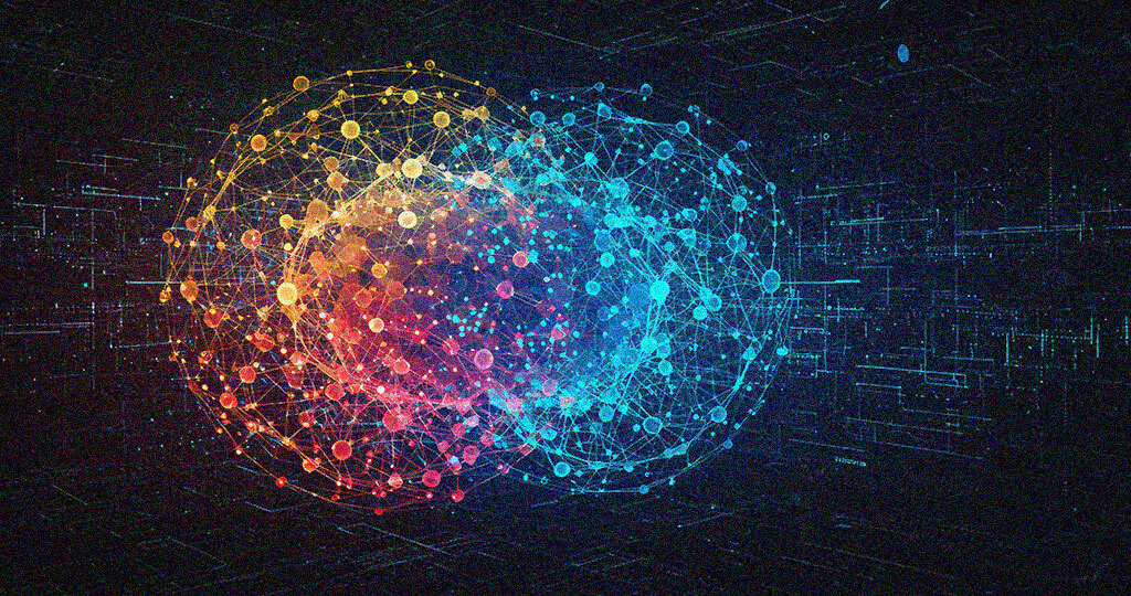
Data plays a big role in how the decisions are made, in today’s digital world. Large amounts of data are created from various sources each day. But this data can be utilized effectively if people can understand it. This is why data visualization is becoming more important than ever before.
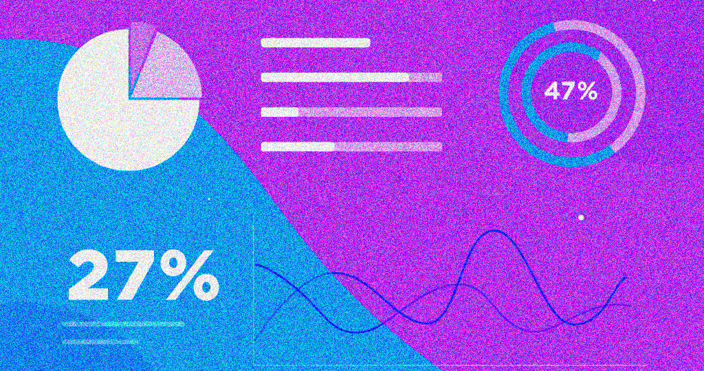
Data visualization is the process of converting numbers and facts into images that are easier to read and understand. It helps people see patterns, connections, and insights that are not always obvious when looking at raw data. As technology grows, so does the way we display and interact with the information.
New trends are shaping the future of how we use and understand data. These trends are not only the tools we use, they are changing the way we think about and approach information itself. Let us discuss five major trends in data visualization that are pointing forward the next big changes in the tech world.
Rise of Real-Time Visuals
One major shift is the move toward real-time data visuals. In the old days, data was often collected, saved, and shown later. The demand for visuals is growing rapidly nowadays, which has the potential to show the updates instantly.
When the data is shown in real-time, it becomes easier to react to changes as they happen. This allows people to make decisions faster and act quickly if something goes wrong. Instant visuals also assists in tracking ongoing situations without any delay.
This trend is becoming more important as technology and businesses depend more on the updates. The ability to see changes in the moment gives the users a strong sense of control and awareness.
Focus on Clear Storytelling
The use of storytelling in data visuals is another growing trend. It is no longer enough to show a chart or graph. Viewers want to know what the data means and why it matters the most. Storytelling through visuals means guiding the audience from the start to the end . It includes highlighting key points, organizing visuals in a logical way, and helping the users follow the flow of information.
This type of storytelling helps the people understand complex data in a simpler and more engaging manner. It also makes it easier for people to remember what they see. Instead of just looking at numbers, viewers connect with the message behind them.
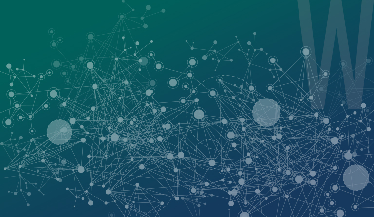
Smarter Tools with Built-In Intelligence
Technology is making the visualization tools smarter. New tools can now assist users in ways that go beyond just drawing graphs. They can suggest the best ways to display data, find trends, and even point out possible issues.
These features come from the use of machine learning and artificial intelligence. The tools learn from past behavior and can help users see patterns they may have missed. This means users do not always need technical skills to create strong visual reports.
As these features become more common, more people will be able to work with data in ways that were once only possible for experts. This is opening the door for a wide group of users to explore and understand information with complexity.
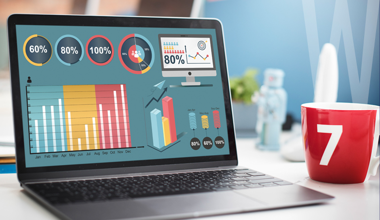
Growth of Mobile and Flexible Dashboards
The way people view data is facing a drastic change day by day. More people are utilizing data using mobile phones or tablets. This is the need that visuals have to been viewed easily across various devices.
The new dashboards are developed in a way to fit into various screen sizes without losing the quality. They are also becoming more interactive, by allowing the users to click, drag, or tap to explore different parts of the data.
These dashboards help the users to work from anywhere. It helps the people to access important data, whether it can be office or on the move. This trend supports flexibility and work easily.
Movement Towards Immersive Experiences
A final trend that is gaining attention is the move toward more immersive visual experiences. As technology changes, people expect more engaging ways to interact with information.
This includes the use of three-dimensional visuals, layered views, and designs that feel more real and connected. Instead of the flat charts, viewers may explore data in a space that feels deeper and more involved.
This kind of design helps the people see relationships between data points in new ways. It allows for deeper understanding and may improve how well users remember and act on information.
Conclusion
The data visualization world is changing rapidly. The above five trends which we discussed above are helping to shape the future of how we use data. As data becomes more central to decision making, the need for clear, useful, engaging visuals continues to grow.
These trends are not just passing changes. They are signs of a bigger shift in how the people expect to work with information. Looking ahead, those who understand and use these trends will be prepared well for the upcoming changes in the technology and business. The data engineering services may keep evolving, but the goal stays the same to make data more meaningful and easier to understand for everyone.