1. Introduction to Data Visualization
Data is everywhere—generated by businesses, governments, scientific research, and even our daily interactions online. However, raw data alone can be overwhelming and difficult to interpret. A data engineering company plays a crucial role in transforming these complex datasets into meaningful visual representations, making it easier to analyze, understand, and act upon.
Imagine a retail company tracking millions of transactions per month. If they rely only on spreadsheets, finding trends would be like searching for a needle in a haystack. But with data visualization solutions provided by a data engineering company, they can create interactive dashboards that instantly highlight best-selling products, seasonal trends, and customer preferences—all in an easy-to-read format.
By leveraging the right data engineering expertise, tools, and techniques, businesses can move beyond raw data and uncover powerful insights that drive smarter decision-making and long-term success.
What is Data Visualization?
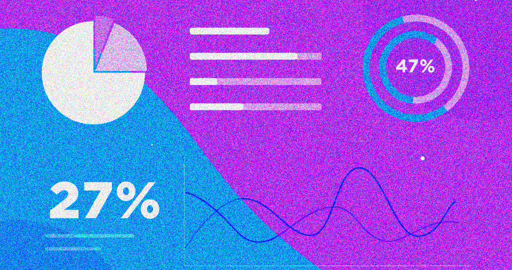
Data visualization is the practice of representing data graphically using elements like charts, graphs, maps, and infographics. Instead of presenting endless rows and columns of numbers, it offers a way to convey insights in a clear, engaging, and digestible format.
For example, a line chart can show a company’s revenue growth over the last five years, while a heatmap can illustrate customer engagement across different regions. These visuals allow decision-makers to identify patterns and correlations at a glance rather than sifting through complex data tables.
How Data Visualization Works
The process of visualizing data follows a structured approach:
- Data Collection & Preparation – The first step is gathering and cleaning the data to ensure accuracy and consistency. Poor-quality data can lead to misleading conclusions.
- Choosing the Right Visualization Type – Not all data is suited for the same visual representation. Selecting the most appropriate graph or chart ensures clarity.
- Designing the Visual Representation – Proper use of colors, labels, and layout enhances readability and impact.
- Interpreting the Insights – The final step involves analyzing the visualization to draw conclusions and make data-driven decisions.
2. Why Data Visualization Matters
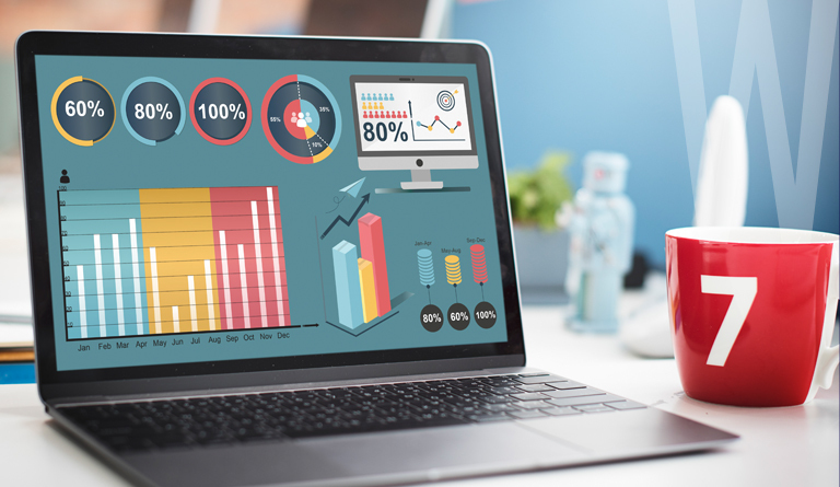
Data visualization is more than just a way to make numbers look attractive—it is a fundamental tool for business intelligence, analytics, and strategic decision-making. When done correctly, it enables companies to process large datasets efficiently and uncover valuable insights that drive action.
1. Faster and More Effective Decision-Making
When data is visually represented, patterns and trends become immediately apparent. This speeds up the decision-making process and eliminates the need for lengthy data analysis.
For example, an e-commerce manager reviewing sales performance can instantly spot seasonal trends through a bar chart and adjust marketing campaigns accordingly, rather than manually scanning reports.
2. Identifying Trends, Correlations, and Patterns
Understanding the relationship between different variables is crucial for businesses and researchers alike. A well-designed visualization can highlight correlations that might otherwise go unnoticed.
For instance, a scatter plot comparing advertising spend to sales revenue can reveal whether increased investment in ads is driving higher returns. This helps marketers optimize their budgets for maximum impact.
3. Communicating Insights Clearly
Presenting raw data to stakeholders—especially those without a technical background—can be confusing. A clear visual representation simplifies complex information and enhances communication.
Consider a company sharing its quarterly revenue report with investors. Instead of presenting a lengthy financial statement, a line graph showcasing revenue growth over time provides a clearer and more impactful message.
4. Spotting Anomalies and Errors
Visual representations of data help detect unexpected fluctuations, outliers, and errors. These could indicate fraud, system failures, or business risks that require immediate attention.
For example, a bank monitoring customer transactions might notice a sudden spike in withdrawals from a particular branch. A quick analysis using heatmaps can reveal if it’s a security breach or just an unusual customer trend.
5. Engaging and Persuasive Presentations
Humans are naturally drawn to visual content. We process visuals 60,000 times faster than text, making data visualization an essential tool for reports, presentations, and marketing materials.
In corporate meetings, an engaging data visualization helps leaders grasp insights quickly, stay engaged, and make informed decisions. Instead of reading a complex financial report, an executive can glance at a dashboard and instantly understand business performance.
3. Common Challenges in Data Visualization
While data visualization offers immense benefits, it also comes with challenges that need to be carefully managed.
1. Choosing the Wrong Visualization Type
Not all visualizations suit every dataset. Using a pie chart for time-series data or a bar chart for percentages can lead to misinterpretation. Selecting the right visualization ensures accuracy and effectiveness.
For example, if a company wants to analyze customer retention trends over time, a line graph is more suitable than a pie chart, which is meant for proportional data.
2. Information Overload
Adding too many elements—colors, labels, or unnecessary graphs—can clutter the visualization and make it hard to read. A clean and simple design is often more effective than a complex, multi-layered dashboard.
3. Misleading Data Representation
Data visualizations should be designed to represent information accurately. However, misleading visuals can distort the interpretation:
- Truncated Y-axes can exaggerate differences.
- Improper scaling can make one category seem disproportionately large.
- 3D effects can make values harder to compare.
4. Lack of Context or Explanation
A visualization without clear labels, legends, or explanations can be misleading. Providing context ensures that viewers interpret the data correctly.
4. Types of Data Visualization
Data visualization comes in many forms, each serving a different purpose. The key is to choose the right visualization type based on the dataset and the insights you want to uncover. Broadly, data visualizations can be classified into basic and advanced types.
Basic Visualizations
These are commonly used in business reports, presentations, and dashboards due to their simplicity and effectiveness. They work well for straightforward data comparisons and trend analysis.
1. Bar Charts – Comparing Categories at a Glance
A bar chart is one of the most widely used visualization types. It represents data with rectangular bars whose lengths are proportional to their values. Bar charts are ideal for comparing different categories, tracking changes over time, and ranking items.
🔹 Example: A retail company analyzing monthly sales across different product categories can use a bar chart to quickly identify which products are performing best.
There are two main types of bar charts:
- Vertical bar charts (column charts) – Typically used for time-series data.
- Horizontal bar charts – Better for ranking categories (e.g., highest-grossing movies).
2. Line Graphs – Tracking Trends Over Time
Line graphs use connected data points to show trends over time. They are best suited for time-series data, where continuous changes need to be visualized.
🔹 Example: A SaaS company tracking monthly user sign-ups over a year can use a line graph to observe seasonal variations and customer growth patterns.
Line graphs are essential in financial analytics, website traffic monitoring, and forecasting trends.
3. Pie Charts – Visualizing Proportions
A pie chart divides a whole into slices that represent percentage proportions. While they are visually appealing, they should only be used when displaying a limited number of categories (typically fewer than five) to avoid confusion.
🔹 Example: A marketing team analyzing website traffic sources (organic search, paid ads, social media, direct) can use a pie chart to see the percentage contribution of each channel.
Best Practices:
✔ Avoid too many slices (overcrowding makes them hard to read).
✔ Use labels or percentages to improve clarity.
✔ Consider alternative charts (like donut charts) for a cleaner look.
4. Scatter Plots – Understanding Relationships Between Variables
Scatter plots use dots to represent values for two different variables and are great for identifying correlations, clusters, or outliers.
🔹 Example: A real estate company comparing house prices to square footage can use a scatter plot to see if larger homes generally cost more.
This type of visualization is commonly used in scientific research, financial analysis, and AI model training.
Advanced Visualizations
For complex datasets, advanced visualizations provide deeper insights by showing hierarchical relationships, patterns, and geographic distributions.
1. Heatmaps – Highlighting Data Density with Colors
A heatmap uses color gradients to represent values, making it useful for spotting hotspots, trends, and variations.
🔹 Example: A website tracking user engagement can use a heatmap to see which areas of a webpage attract the most clicks.
Other applications include:
✔ Customer behavior analysis (e.g., most frequently purchased products).
✔ Stock market analysis (e.g., tracking price fluctuations).
✔ Healthcare research (e.g., disease outbreaks across different regions).
2. Tree Maps – Visualizing Hierarchical Data
A tree map represents data as a series of nested rectangles, with each rectangle’s size corresponding to its value. This visualization is ideal for showing hierarchical relationships in a space-efficient manner.
🔹 Example: A company analyzing revenue contributions from different product lines can use a tree map to see which products generate the most revenue.
Tree maps are commonly used in portfolio management, market segmentation, and financial reporting.
3. Network Diagrams – Mapping Relationships Between Entities
A network diagram shows connections between different elements, making it valuable for analyzing relationships and interactions in complex datasets.
🔹 Example: A cybersecurity team tracking fraudulent transactions can use a network diagram to identify suspicious connections between accounts.
Network diagrams are also widely used in social media analysis, supply chain optimization, and organizational mapping.
4. Choropleth Maps – Visualizing Geographic Data
A choropleth map is a geographical visualization that uses color shading to represent values across different regions. It is commonly used in demographics, politics, and public health studies.
🔹 Example: A government agency tracking unemployment rates across states can use a choropleth map to highlight areas with high or low unemployment.
Other applications include:
✔ COVID-19 infection rates by region.
✔ Voting patterns in elections.
✔ Crime rate analysis by city.
5. Data Visualization Techniques and Tools
To create effective visualizations, businesses and analysts rely on various techniques and tools based on the type of data and the insights they seek.
Data Visualization Techniques
1. Descriptive Visualization – Summarizing Historical Data
This technique focuses on representing past data to identify trends and patterns. It is commonly used for business reporting and performance tracking.
🔹 Example: A company analyzing yearly revenue trends might use a line graph or bar chart to compare financial performance over multiple years.
Descriptive visualizations are crucial for understanding past performance and making strategic improvements.
2. Diagnostic Visualization – Finding the ‘Why’ Behind Data Trends
Diagnostic visualizations go beyond what happened and aim to explain why it happened.
🔹 Example: A SaaS company noticing a drop in subscription renewals might use a scatter plot or heatmap to identify potential reasons—such as poor customer experience or pricing issues.
This technique is widely used in root cause analysis, marketing attribution modeling, and product performance analysis.
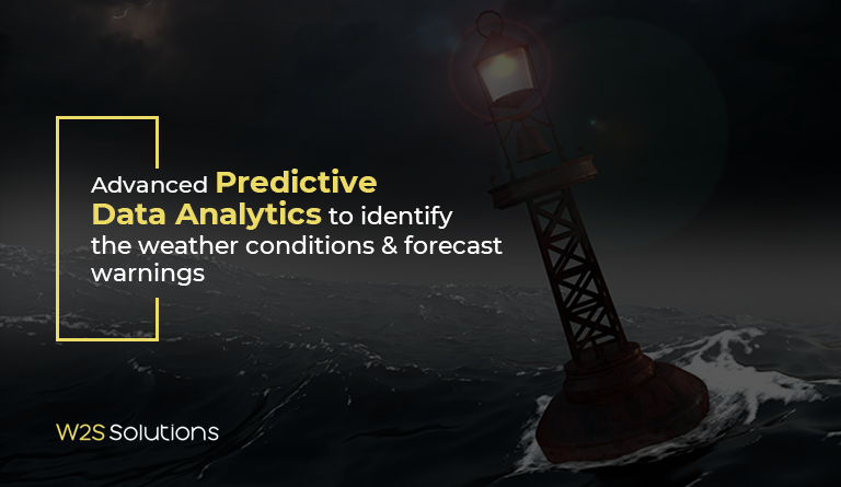
3. Predictive Visualization – Forecasting Future Outcomes
Predictive visualization uses historical data, machine learning, and statistical models to forecast future trends.
🔹 Example: A financial firm predicting stock price movements can use trend lines and AI-driven visualizations to estimate future performance.
Other use cases include:
✔ Predicting customer churn rates.
✔ Forecasting weather conditions.
✔ Estimating demand for products.
Popular Data Visualization Tools
To create these visualizations, businesses rely on powerful software tools designed for different needs.
1. Tableau – The Gold Standard for Interactive Dashboards
✔ Best for enterprise analytics and real-time data visualization.
✔ Offers drag-and-drop functionality, making it user-friendly.
✔ Supports live connections to databases and cloud services.
🔹 Example: A sales team uses Tableau dashboards to track daily, weekly, and monthly sales performance.
2. Power BI – Ideal for Business Intelligence
✔ Developed by Microsoft, integrates well with Excel and SQL databases.
✔ Best for corporate reporting, KPI tracking, and business intelligence.
✔ Enables AI-powered insights for advanced analytics.
🔹 Example: A company monitoring supply chain efficiency uses Power BI to track shipments, delivery times, and costs.
3. Python Libraries (Matplotlib, Seaborn, Plotly) – For Custom Visualization
✔ Used by data scientists and developers for advanced analytics.
✔ Allows full customization and automation of reports.
✔ Integrates with machine learning and AI models.
🔹 Example: A researcher using Seaborn to create a heatmap showing correlations between different economic indicators.
Final Thoughts
The right data visualization type, technique, and tool can turn raw data into valuable insights. Whether you’re a business leader, data analyst, or researcher, leveraging data visualization effectively leads to smarter decisions and better results.
For businesses handling large-scale data processing, analytics, and AI-driven insights, partnering with a data engineering company can be a game-changer. A specialized data engineering firm ensures that data is properly collected, processed, and visualized using cutting-edge tools and methodologies, enabling organizations to unlock the full potential of their data for innovation and growth.